24 / BD 78 Faust
-
Lino

- Joined: Wed Nov 03, 2004 6:18 am
- Location: Sitting End
- Contact:
-
HerrSchreck

- Joined: Sun Sep 04, 2005 11:46 am
Ah.. now if Massino & the boys at Flicker Alley can push out the Berrauita PHANTOM disc in "mid June" (his last quote to me about 5 wks ago) then I can put away Zappas THE TORTURE NEVER STOPS. Waiting for these two (and now WARNING SHADOWS.. fuckin W A R N I N G S H A D O W S no less) has beenn agony.peerpee wrote:Final specs are now at the site. This 2 x disc set is now finished and will be released on June 26th.
http://www.eurekavideo.co.uk/moc/024.htm
Nick any possibility of getting around to some of those Carl Mayer string of Kammerspiels that ended with THE LAST LAUGH? i e BACKSTAIRS, SCHERBEN, or SYLVESTER? I would collapse with weeping and sing glories to the merciful savior in overweight-black-lady tones (waving my hands inna sky at the spirit) if you did. If you guys came out with the last two especially (FWMS has them in preservation) you would officially become The Coolest Most Thoroughly Solid Dudes In Interplanetary Dvd-dom, and with one stroke revise the "what's great in silent film" paradigm around the world . Even DIE STRASSE or RASKALNIKOV would be glorious.
-
denti alligator

- Joined: Wed Nov 03, 2004 9:36 pm
- Location: "born in heaven, raised in hell"
I have a hunch that PHANTOM will be MoC spine #23 or #25 ...HerrSchreck wrote:Ah.. now if Massino & the boys at Flicker Alley can push out the Berrauita PHANTOM disc in "mid June" (his last quote to me about 5 wks ago) then I can put away Zappas THE TORTURE NEVER STOPS. Waiting for these two (and now WARNING SHADOWS.. fuckin W A R N I N G S H A D O W S no less) has beenn agony.
Nick any possibility of getting around to some of those Carl Mayer string of Kammerspiels that ended with THE LAST LAUGH? i e BACKSTAIRS, SCHERBEN, or SYLVESTER? I would collapse with weeping and sing glories to the merciful savior in overweight-black-lady tones (waving my hands inna sky at the spirit) if you did. If you guys came out with the last two especially (FWMS has them in preservation) you would officially become The Coolest Most Thoroughly Solid Dudes In Interplanetary Dvd-dom, and with one stroke revise the "what's great in silent film" paradigm around the world . Even DIE STRASSE or RASKALNIKOV would be glorious.
Schrecko: has RASKOLVINKOV been restored?
-
HerrSchreck
- Joined: Sun Sep 04, 2005 11:46 am
I doubt it-- theres a FaceTs vhs of it hanging around, and my suspicion is we'd be starting, like the Pick/Mayer's, with preservation nitrates sitting in the Murnau Foundation vaults. My guess is Gosfilmofond would have a solid print of this (what dont they have gorgeous prints of? aside from vaults that were the only ones NOT overrun by an invader during WW2-- and being such active participants in cinema, w to & fro's w all the major source countries since at least the early teens-- they also had the advantage of rolling over the German archives, which had in turn, prior to be rolled over by the Soviets, rolled over all the major vaults in central and western .. and eastern.. Europe. So the Soviets have stuff in there, we'd go bananas if we looked at an inventory of what these guys are sitting on! They actually, truly, have everything. From their own undisturbed collections, and from vamping the vamper who vamped all of europe.)
RASKALNIKOV is one of the more interesting adaptations of CRIME & PUNISHMENT, and one of the more successful post-Caligari, purely expressionist films.. coincidentally (or not) by Veine. The extremely warped art direction (think the Jack episode of WAXWORKS) of acute angles, jagged edges & corners, etc, are a perfect exterior manifestation of the warped interior life of Raskalnikov himself. I hope this finds a home on dvd soon.. its certainly more successful than MORNING TO MIDNT, TORGUS, & GENUINE (which actually has grown onme.. such a bizarre & obscure atmosphere, I kind of found my way into it), other purely expressionist looking films, because there is a reason for the strangeness in the text. Another reason THE STREET works so well too.
RASKALNIKOV is one of the more interesting adaptations of CRIME & PUNISHMENT, and one of the more successful post-Caligari, purely expressionist films.. coincidentally (or not) by Veine. The extremely warped art direction (think the Jack episode of WAXWORKS) of acute angles, jagged edges & corners, etc, are a perfect exterior manifestation of the warped interior life of Raskalnikov himself. I hope this finds a home on dvd soon.. its certainly more successful than MORNING TO MIDNT, TORGUS, & GENUINE (which actually has grown onme.. such a bizarre & obscure atmosphere, I kind of found my way into it), other purely expressionist looking films, because there is a reason for the strangeness in the text. Another reason THE STREET works so well too.
-
TheWatcher
- Joined: Wed May 10, 2006 5:50 pm
- Location: Australia
-
Monsieur Verdoux

- Joined: Tue May 16, 2006 4:56 pm
- Location: Bristol, UK
- Contact:
-
peerpee
- not perpee
- Joined: Tue Nov 02, 2004 3:41 pm
-
Lino
- Joined: Wed Nov 03, 2004 6:18 am
- Location: Sitting End
- Contact:
-
HerrSchreck
- Joined: Sun Sep 04, 2005 11:46 am
-
Steven H

- Joined: Tue Nov 02, 2004 3:30 pm
- Location: NC
Excerpt from the DVDBeaver review:
I can't begin to tell the good people of this forum how dissapointed I am that I'm too poor to afford this right now. Goodness.Gary Tooze wrote:The Eureka is the best edition available at present. It improves upon every area of the previous DVDs.
The David Ehrenstein and Bill Krohn commentary is one of the best - a real pleasure to hear such thoroughly prepared and organized discussion. They work extremely well together - almost finishing each other's sentences in many instances. Tony Rayns is always a pleasure to hear and his erudite dissemination of information is the best in the DVD supplement community. He discusses quite a lot in less than 40 minutes including topics divided into such topics as 'Murnau's Mise en scene' and 'Weimar Culture' etc.
The entire Eureka package is so beautifully done with marvelous artwork and the included booklet. Again Master of Cinema have given DVD/dfilm fans a real keepsake with such an interesting and historically significant film wonderfully presented with relevant extra features that further enhance appreciation.
P.S. The old commentary track that appeared on the original Eureka disc wasn't done very well - but the bulk of that information (spoken by Timothy Brock) has been reconstituted into the essay printed in the 28-page liner notes booklet.
We strongly recommend the Eureka 2-disc Masters of Cinema edition.
-
denti alligator
- Joined: Wed Nov 03, 2004 9:36 pm
- Location: "born in heaven, raised in hell"
Maybe I should hold my mouth until I get my copy in the mail, but I see some troubling jagged lines in the screen caps at DVD Beaver. Is this just me?
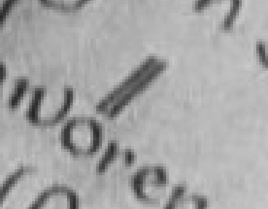
Compare the umlaut over the "o" in "beschworen" in cap no. 1.
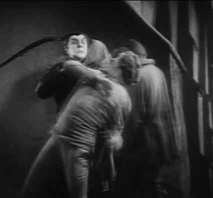
Compare the folds in the tent to the left of the feet of the man doing a handstand in the 2nd capture.
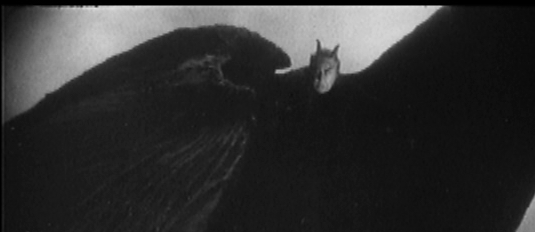
Compare the crest of Mephistopheles' right wing (on the left of the screen).
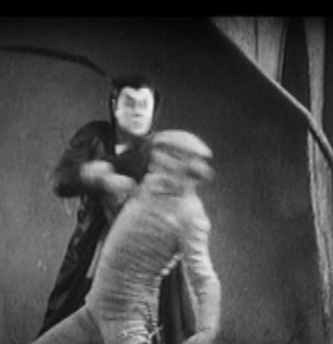
Compare (most tellingly) that little stub of a branch jutting out of the left side of the tree in the 4th captures.
And also very revealing are the last captures: look at the top of Mephisto's hat.
If you look at these next to the Divisa Red caps you can see that these lines aren't smooth, but broken up. This is usually a sign of an interlaced DVD, so I'm confused why they're appearing here. Or did Gary mix up his screen caps?
The Divisa Red caps also seem to me to be sharper, though the black levels are better on the MoC. The "beschworen", for example, looks like "beschworer" in the Divisa Red cap.
Compare the umlaut over the "o" in "beschworen" in cap no. 1.
Compare the folds in the tent to the left of the feet of the man doing a handstand in the 2nd capture.
Compare the crest of Mephistopheles' right wing (on the left of the screen).
Compare (most tellingly) that little stub of a branch jutting out of the left side of the tree in the 4th captures.
And also very revealing are the last captures: look at the top of Mephisto's hat.
If you look at these next to the Divisa Red caps you can see that these lines aren't smooth, but broken up. This is usually a sign of an interlaced DVD, so I'm confused why they're appearing here. Or did Gary mix up his screen caps?
The Divisa Red caps also seem to me to be sharper, though the black levels are better on the MoC. The "beschworen", for example, looks like "beschworer" in the Divisa Red cap.
Last edited by denti alligator on Thu Jun 22, 2006 11:21 pm, edited 1 time in total.
-
mbalson

- Joined: Tue Nov 02, 2004 11:26 pm
- Location: Toronto,Canada
- Contact:
-
denti alligator
- Joined: Wed Nov 03, 2004 9:36 pm
- Location: "born in heaven, raised in hell"
Well, I'm glad I'm not alone in seeing this. I didn't want to seem like a freak whose shitting on MoC's most astounding release to date.Senya wrote:Unfortunately, those jaggies are not only in the screen caps.
It looks like interlaced picture, not progressive. Why?..
I don't know how a "progressively encoded transfer" differs from a regular progressive transfer, but maybe that's the culprit. But then, why does the Spanish DVD look ok?
Senya, is it really noticeable? If it is, I guess I'll be buying the Spanish disc as well
-
skuhn8

- Joined: Tue Dec 14, 2004 4:46 pm
- Location: Chico, CA
-
Gary Tooze

- Joined: Thu Nov 04, 2004 9:07 pm
- Contact:
If you guys are referring to this:
it is on the Spanish release as well (in fact that capture is from the Spanish release). I am pretty sure the MoC Faust is progressive - in my viewing and review I did not notice the common 'trailing' that is a result of progressive flags not being identified. I'm not seeing it. I suspect what you are noticing may have something to do with frame -rate conversion (silent->PAL), but perhaps Nick can further elaborate.
Best,
Gary
-
mbalson
- Joined: Tue Nov 02, 2004 11:26 pm
- Location: Toronto,Canada
- Contact:
No magnification needed for what I'm talking about. In fact enlarging the image hides the interlaced looking edges.
This is what i'm talking about:

And this tree is a jagged mess compared to the divisa disc:

I've ordered this disc regardless. The last thing I want to do is rag on MoC, I just don't want this issue to be true.
Gary, could this be a by-product of resizing the screen caps?
This is what i'm talking about:
And this tree is a jagged mess compared to the divisa disc:
I've ordered this disc regardless. The last thing I want to do is rag on MoC, I just don't want this issue to be true.
Gary, could this be a by-product of resizing the screen caps?
-
Gary Tooze
- Joined: Thu Nov 04, 2004 9:07 pm
- Contact:
-
Senya
- Joined: Thu Jun 22, 2006 10:05 pm
Yes, if you use a computer monitor and PowerDVD player. Sorry, but I was not able to check it on good tube or plasma TV.denti alligator wrote:Senya, is it really noticeable?
Also I am going to use my PowerDVD to make some screenshots in Bob and Weave modes. May be missing progressive flag (mentioned before) is the only reason of this "feature".
-
Gary Tooze
- Joined: Thu Nov 04, 2004 9:07 pm
- Contact:
-
denti alligator
- Joined: Wed Nov 03, 2004 9:36 pm
- Location: "born in heaven, raised in hell"
Unfortunately I only use a computer monitor--that is, I'm set up with an HTPC and an LCD screen. Maybe some post-processing can eliminate this... if it is indeed as noticeable as you say. Or maybe it was a mistake ... I can't imagine something like this getting by quality control.Senya wrote:Yes, if you use a computer monitor and PowerDVD player. Sorry, but I was not able to check it on good tube or plasma TV.denti alligator wrote:Senya, is it really noticeable?
Also I am going to use my PowerDVD to make some screenshots in Bob and Weave modes. May be missing progressive flag (mentioned before) is the only reason of this "feature".
-
peerpee
- not perpee
- Joined: Tue Nov 02, 2004 3:41 pm
We had difficulties a few months ago when we assessed Murnau Stiftung's master.
It appears that, for whatever reason, the only master materials they had was a PAL digibeta which had originally been made from an NTSC telecine, which had been very well converted to PAL using Alchemist. We tried to obtain the original NTSC telecine but they couldn't locate it anywhere and weren't even aware of the lineage of the master in the first place.
Unable to warrant the cost of a new telecine and repeat Murnau Stiftung's costly restoration, our options were to release an interlaced disc or to remove the 2:3 pulldown and make it progressive. Doing the latter introduced slight jagginess where harsh white met jet black, but the motion was lovely on all displays, as it was progressive.
The key thing is what it looks like in motion, and it looks really good.
I've viewed it for the last few months on an HD progressive display, and, in the circumstances, am happy with it. Whenever the DVD is paused, it is possible to see slight jaggies occasionally, but this does not ruin the viewing experience when the film is in motion -- as it's practically unnoticeable.
The Domestic version of FAUST on the new MoC set is *not* interlaced, and does not have any combing. Here are some more screenshots:
-
Scharphedin2

- Joined: Fri May 19, 2006 7:37 am
- Location: Denmark/Sweden
I read DVDBeaver's review and looked at the stills, and, even if it is possible to find "jaggies" in some of the stills, the improvement over the earlier DVD releases of the film is such that I am not sure that I own the superlatives in my vocabulary to express it...
I am curious... do any of you people who posted on this thread actually notice these miniscule discrepancies in transfers, when actually watching the films? I have never personally been able to, but possibly that is because I view my DVDs on a projector, where I expect the image to be a little less "sharp" than what I imagine it will be on a computer (having never actually tried this).
I already ordered my copy, and I cannot wait to see this film. The extras, what will surely be beautiful cover art, and another wonderful booklet -- along with what to my eyes look like a gorgeous transfer -- makes this a completely impossible DVD to resist.